REFLECTION // BUILDING A BRAND:
. ݁⊹ ݁˚⋆•ᴗ•⋆˖。˚. ݁₊
ASSIGNMENT // PERSONAL BRAND:
Design Brief: Create a brand for yourself including a logo, color palette and typography. For the logo show your sketches and the process from ideation to completion. Show how your brand can come to life by mocking up a personal website in desktop and mobile. Add your slides here with your name.
.⋅˚₊‧⋆ᵕ̈‧₊˚ ⋅ MY PERSONAL BRAND .⋅˚₊‧ ᵕ̈⋆‧₊˚ ⋅.
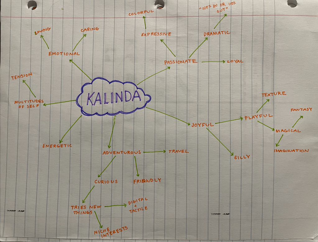
For my personal brand I started off with the in-class exercise of creating a word/concept tree about myself. Along with consulting my friend Amanda in class, I also spoke to a couple people outside of class about the tree I made to help inform my decision about my brand from some people who know me best.
The key words and concepts I came up with were:
playful ⊹ ࣪ ˖ magical ⊹ ࣪ ˖ fantasy ⊹ ࣪ ˖ retro ⊹ ࣪ ˖ adventurous ⊹ ࣪ ˖ digital and tactile ⊹ ࣪ ˖ imagination ⊹ ࣪ ˖
Next, I started thinking about the logo/iconography. And while I started drawing logos, I was reminded of a similar project I did in undergrad and how much I disliked the look of trying to make a logo out of the letters ‘K’ and ‘P’. No matter how hard I try, I can never get something that rings true. I also don’t necessarily like that a logo that is stagnant and can’t really be changed often. So I came up with the idea to stick with my initials “KP” as my logo (it also works well because some people call me that as a nickname!) and instead do a study in ways I can visually represent KP. I had a lot of fun thinking of different fonts and various patterns and textures I could use.
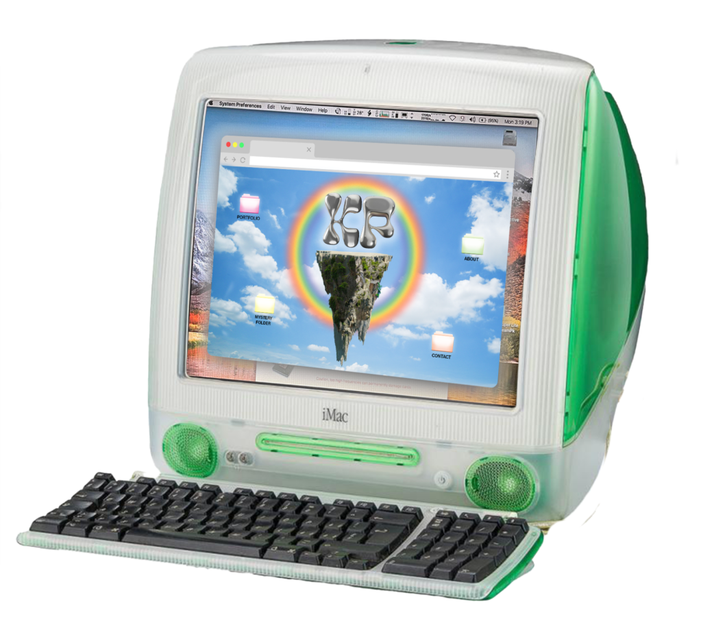
After playing around with the logo, I moved onto the mood board and gathered visual inspiration. I used a combination of the words I identified in my original self-reflection exercise as well as various iconography ideas I had when thinking about the logo. In the end I decided I wanted to pursue a magical take on vintage technology, a vibe I feel encapsulates who I am and my interests fairly well.
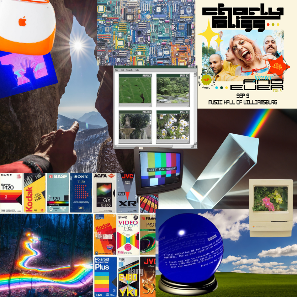
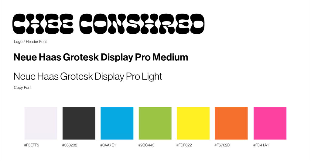
My brand colors are taken from a vintage VHS blank tape box and my brand fonts are a funky and bold font paired with a much simpler one for the copy. The design of my website is a mashup of the older Mac desktop with a modern fantasy take on the famous “bliss hill” desktop image from Windows XP.
All in all this was probably one of my favorite projects to create despite it taking quite a bit of time. I ended up with a brand concept I truly love that reflects who I am through and through. While I originally was going to keep this as a simple mock-up, I might actually make this website after all because I ended up falling in love with the whole concept.
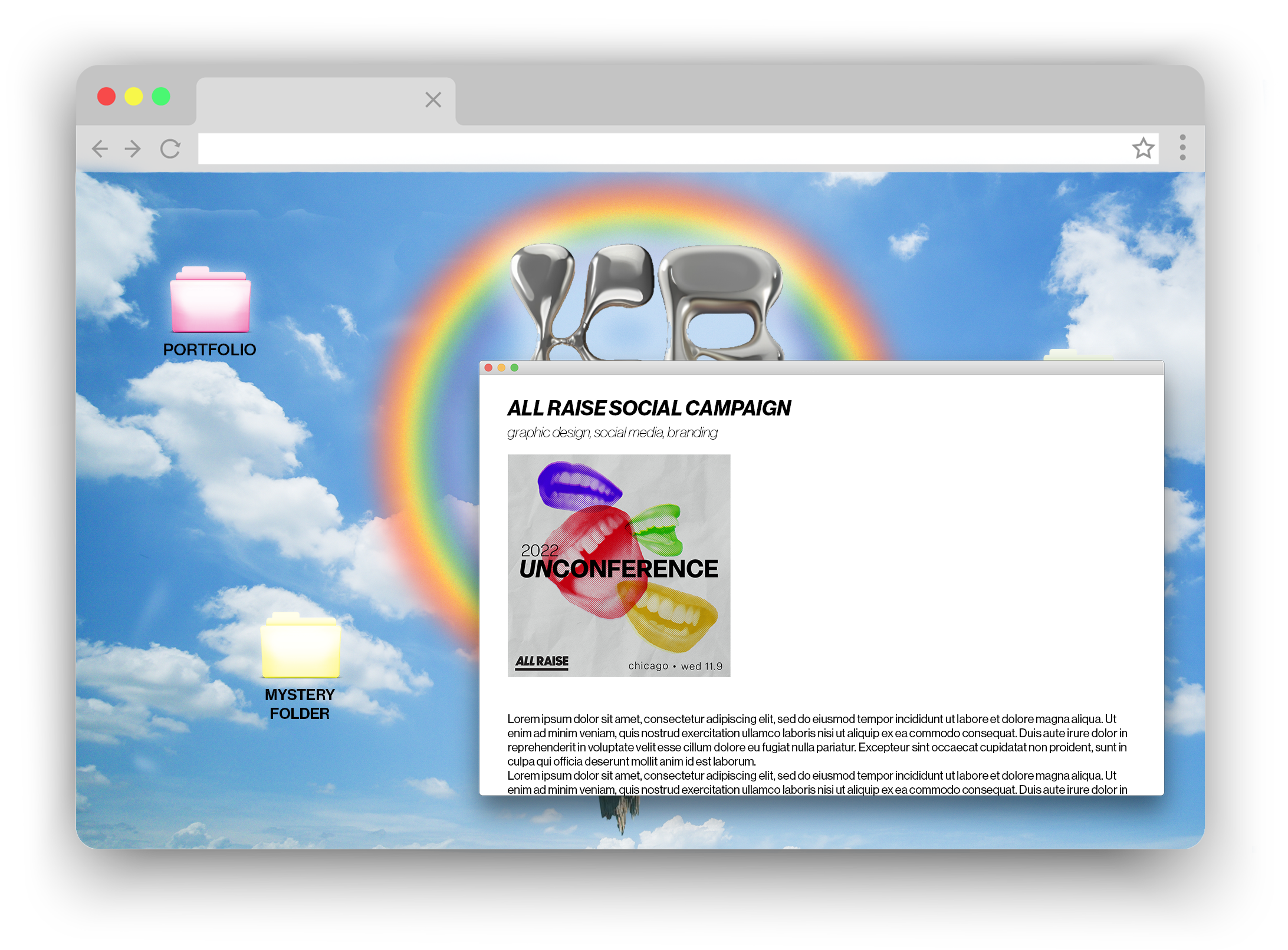
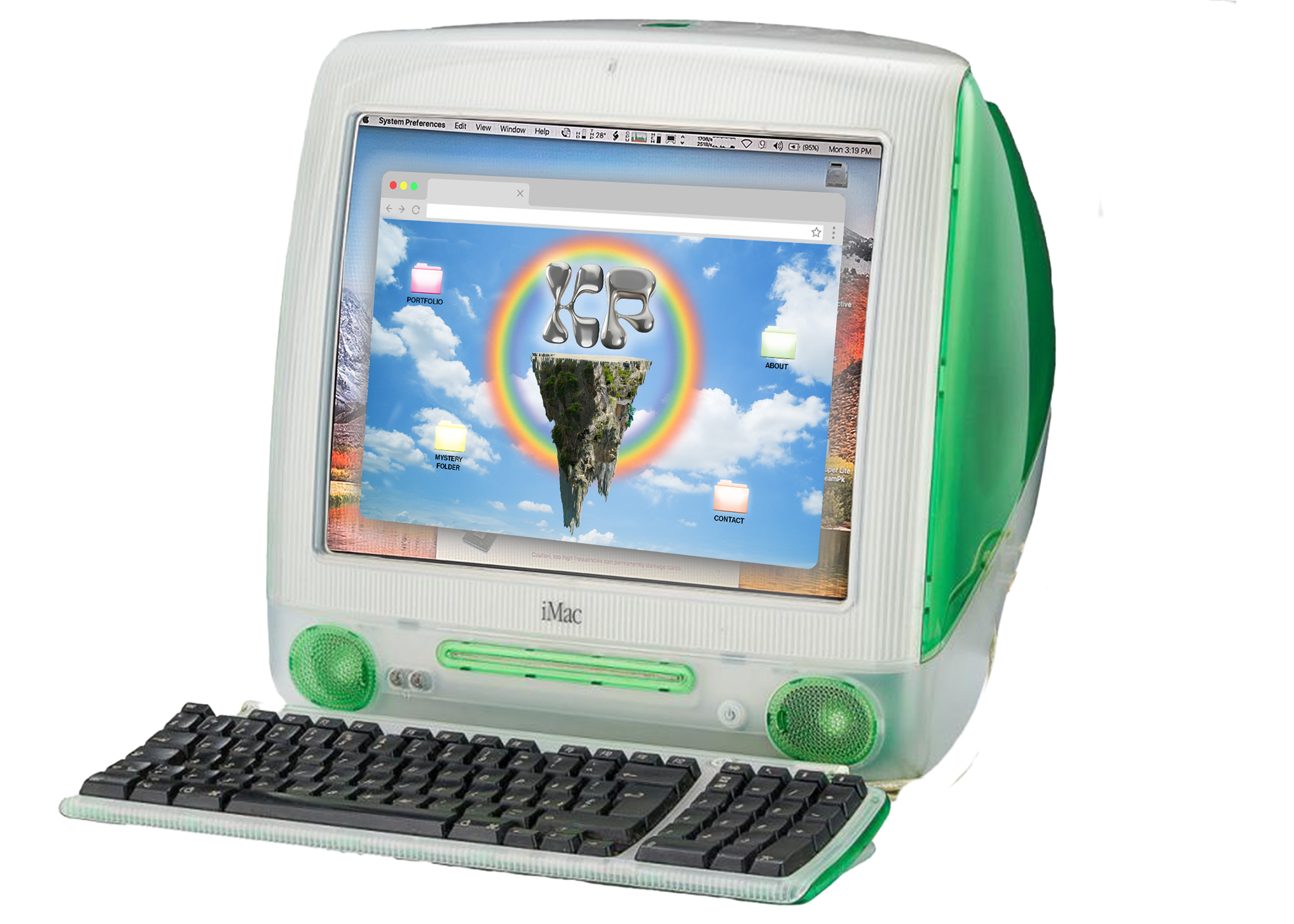
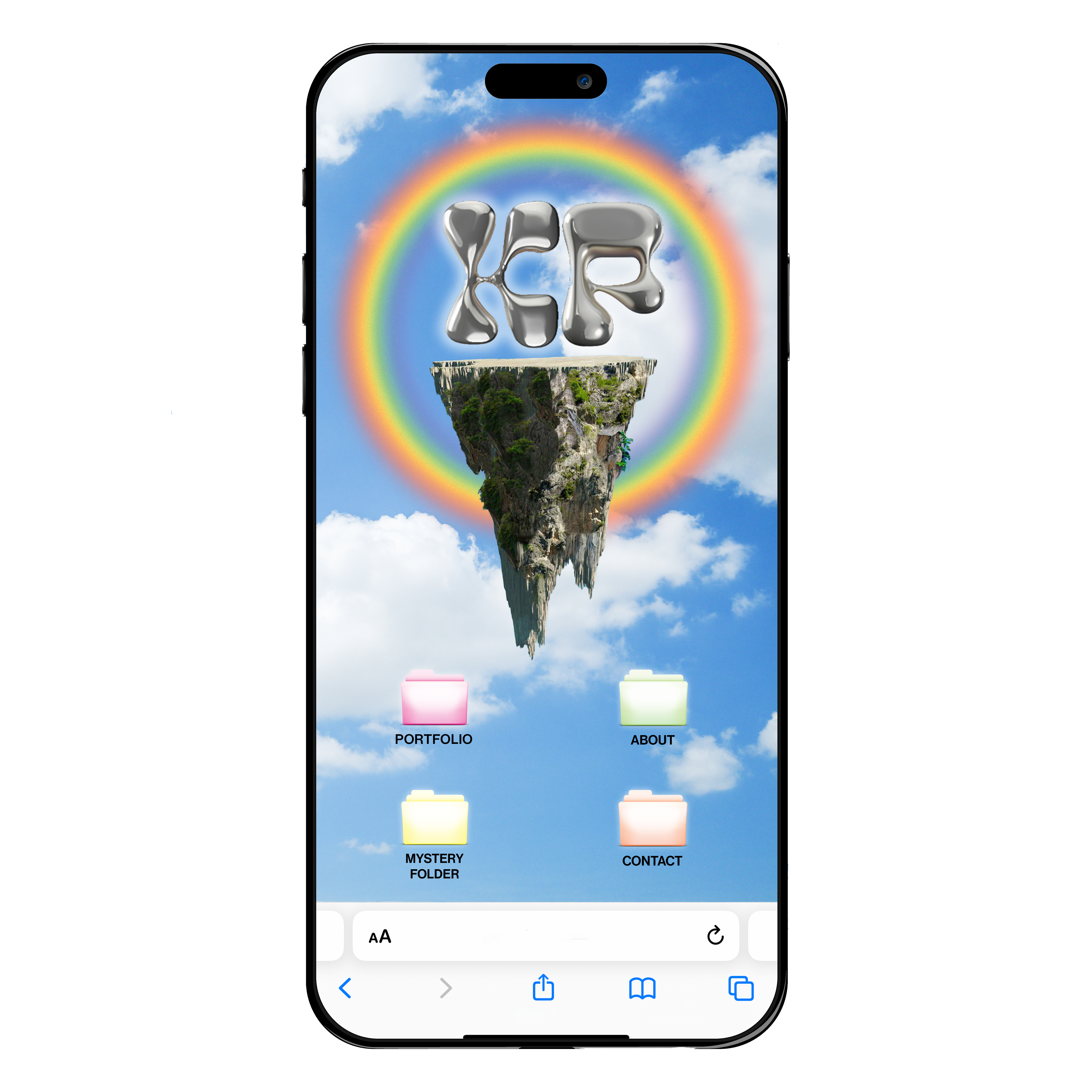
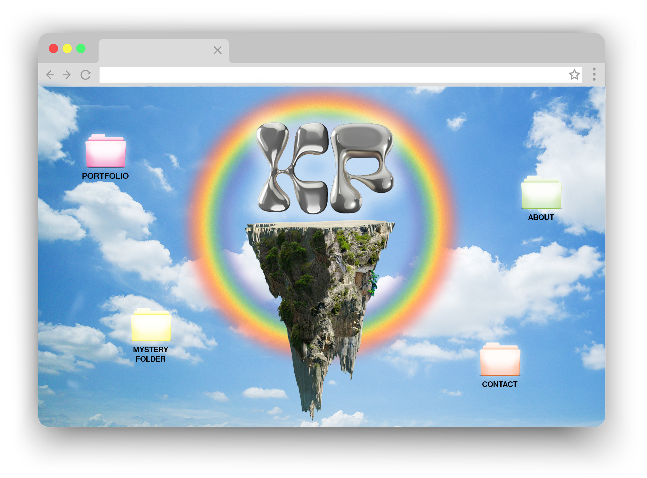
When I dropped my concept into the class folder, I got really nervous about my design direction because so many other people had taken a really beautiful streamlined approach to their sites and mine was a bit more ‘out of the box.’ Even if from a UX/UI perspective mine is a little less simple to navigate, I think the added friction is worth the visuals and personality. In the end it was a good reminder to stay the course and be true to yourself creatively, even if it feels a bit scary to go against the grain.
. ݁⊹ ݁˚⋆•ᴗ•⋆˖。˚. ݁₊

Leave a comment