REFLECTION // BUILDING A BRAND:
After
. ݁⊹ ݁˚⋆•ᴗ•⋆˖。˚. ݁₊
ASSIGNMENT // COLOR OF YOU:
Design Brief: Choose a palette of five colors that represent YOU. Using your palette, create four square compositions. Each composition should include all five colors of your palette but applied in different quantities. The colors in your palette can be the same hue but different saturations of that hue or 5 different hues. You can create your compositions by using geometric or abstract shapes. Try using p5 to create one of your compositions. Perhaps you could find inspiration in the generative artwork of Vera Molnar.
.⋅˚₊‧⋆ᵕ̈‧₊˚ ⋅ COLOR OF YOU .⋅˚₊‧ ᵕ̈⋆‧₊˚ ⋅.
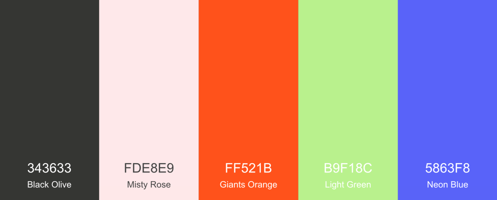
For my colors, I decided to go with a bright and fun pallet that included some of my favorite colors- purple, orange, and green. Because I picked such vibrant versions of those colors, I opted for some muted supporting colors. I didn’t want to go with a boring black and white, so I instead chose a warm grey and very light pink that I felt were simple yet still visually engaging. I used a an online color generator called coolors which I had used before in undergrad that helps you build out cohesive color pallets easily.
I used those colors in a couple of different ways that included creative coding, 3d modeling, and ai image generation. I wanted to take a playful approach and use a variety of digital tools to help bring the colors to life.
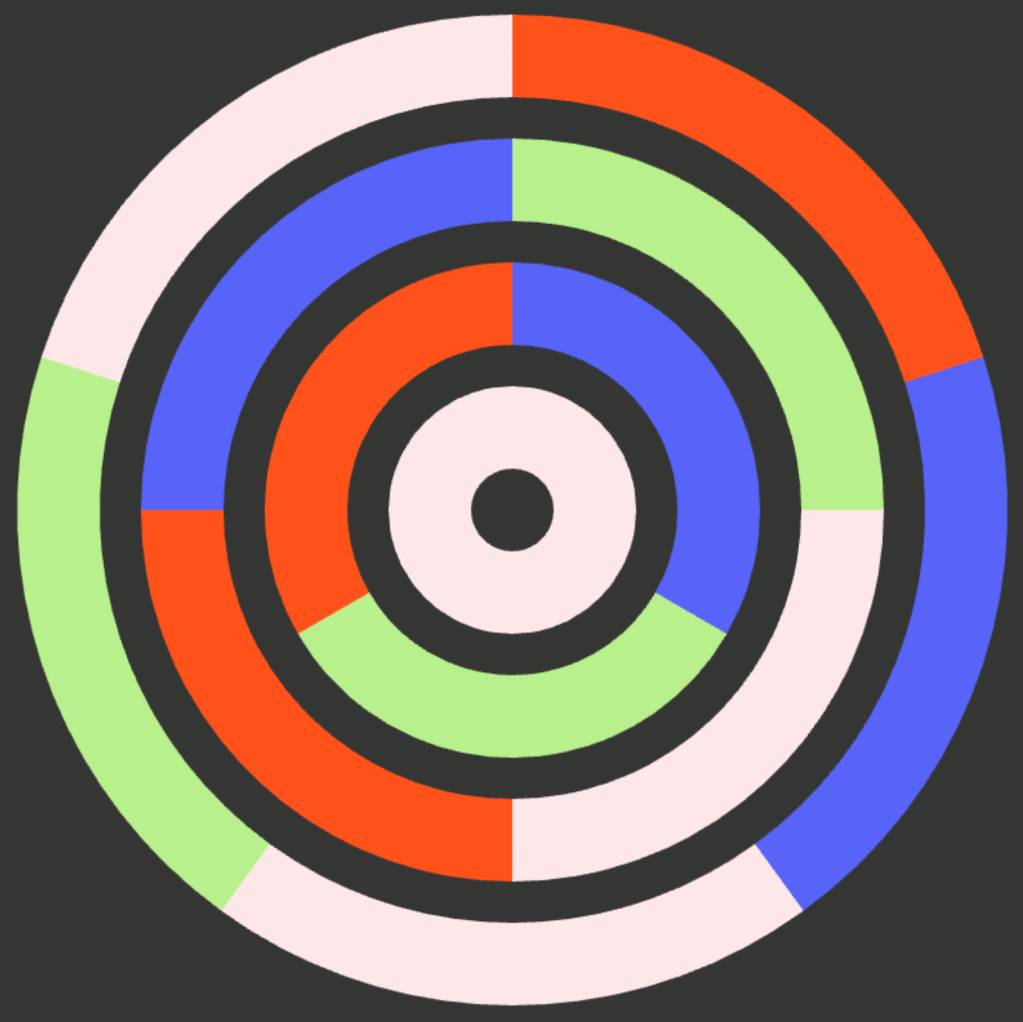
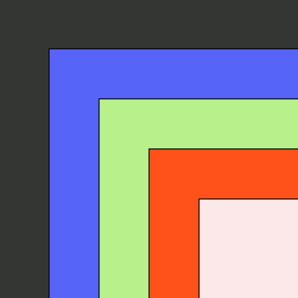
For the creative coding, I found some fun examples of code that I thought could make for interesting compositions and then modified them slightly and added in my unique color pallet. Out of the two, I liked the stacked squares better because it just looks so visually pleasing to see the colors stacked from light to dark.
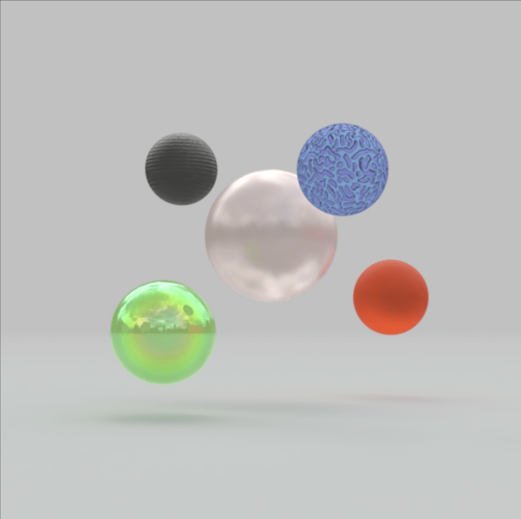
Next, I decided I wanted to play with the colors with an emphasis on texture. I went into a program called Womp and created various balls. After including the colors, I edited the materials used to create different contrasts in texture with the color. It was interesting to see how different materials could also influence how a color looked and belonged with the others. For some of the colors, choosing specific materials would change the appearance of the color so much that it almost didn’t appear to go with the original swatch I had chosen.
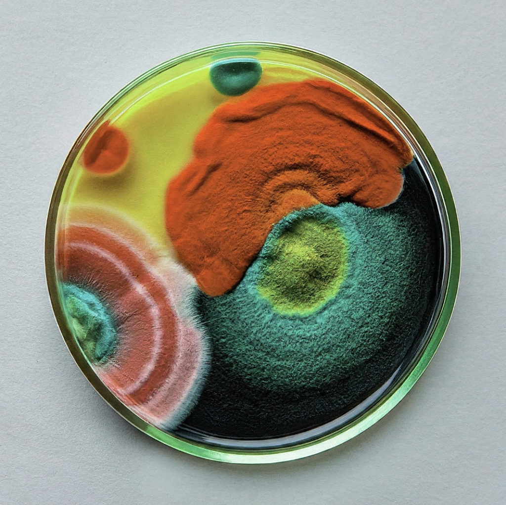
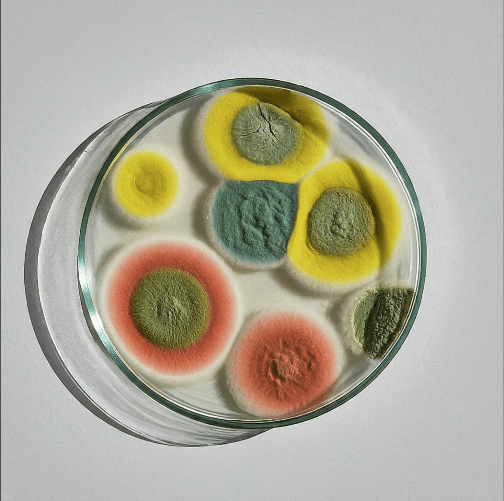
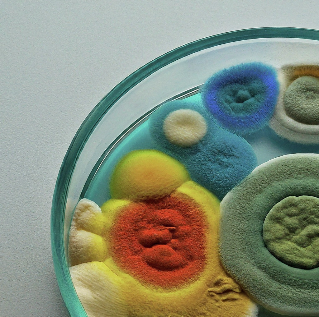
Lastly, I decided to try my hand at AI image generation using Google Gemini. I haven’t used very much AI image generation mainly because I try to be concious of how much I use AI for ethical reasons. While I am not fully against AI, I do believe that most AI companies operating today would not be able to function without shady business practices that steal the works of others without compensating them. Not to mention the environmental and human rights violations that gets tied up in pursuing this technology.
That being said, I felt like this was a great excuse to explore a bit further in this space. I felt like a lot of my colors looked like really cool mold. I know that sounds really weird but if you really look at mold it is actually quite pretty and has a lot of really cool textures. There is an artists that works primarily in mold as a medium and I always love seeing her cool mold art explorations. That being said, this was by far my most favorite of the color explorations I did and I love how it turned out. While it was difficult to get the AI to return mold in the colors I requested, I feel like most of the time it was pretty spot on. I don’t really see myself using AI as part of a regular creative practice any time soon but it is certainly a useful and fun tool to have at your disposal.
. ݁⊹ ݁˚⋆•ᴗ•⋆˖。˚. ݁₊

Leave a comment